Instead, I ripped them off and made 5 new log cabin blocks to replace them with, and this time put the red on the top, right, and blue on the bottom, left instead of alternating it like last time. Makes all the motif insides look the same level, and I like it much better. :)
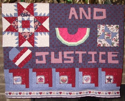
I didn't pick apart OR throw out the other 4 log cabin blocks. They're just the right size to fit across the quilt, so I'll use them on the back, as a reminder to myself that I prefer the logs in a little log cabin block to be very close in color/value!
Not sure if I'll leave the border fabric with hearts/baskets/stars along the bottom or not. There's enough to put a matching row along the top too, what do you think? Is it too busy? One row, two, or leave it off? Think it'll look different with a solid dark border next to it?
Now onward to making the wonky house and firecracker!





12 comments:
This is looking so good - I love the bite out of the water melon and the new log cabin blocks - as you rightly said the originals made your eyes bump up and down as you looked along the row - these are definitely more aesthetically pleasing. Personally I don't think that border is too busy - it's lovely and if you have enough for a matching row at the top it will balance if beautifully. All in all coming along really nicely, well done
YES! I like the lc blocks better this way, too. I also like that border and think one along the top would be great, too. Then a dark border all around the whole thing would look good, too. This is really turning out cute!
I too prefer the new log cabins and love the border. This quilt is looking better and better!
Oh yeah, looking better each day!
hey I am in the majority, like the new little border print..and good for you to make that design change and be happier for doing it!
Oh I totally agree with the choice. Before they looked as if some of them were a little cockeyed. This version is a much better look... clean clear and organized. Makes all the difference!
I'll have more letters for you soon Jane!!
Yeah, I like the border too. And the new blocks. Good job!
A good choice to change the Log Cabin blocks :-) Your quilt is coming along nicely !
OK..I'm probably going to have to duck behind the fence here to keep from getting hit by flying watermelon, but I think the parts that are pre-printed are neat, but don't over due them, unless you are deliberately going for a "cute" look. The pre-print border seems to re-enforce the other pre-printed parts rather than compliment the pieced parts..and the pieced parts are what is sooooo great about this unique quilt...only my honest opinion...please don't hate me *S*
*spits a watermelon seed at Finn*
I'm glad you're recycling your other log cabins! But I agree with Finn, I don't really like the bottom border!
But since I'm so new to quilting you can ignore me at will!
*ducks watermelon seed*
Yeah, I'd probably go for the less cutesy look as well. Would love to see a strong red or navy down there. Love that feathered star.
And in the minority, I really liked the way you had the old log cabin blocks, but I'm screwy.
Post a Comment