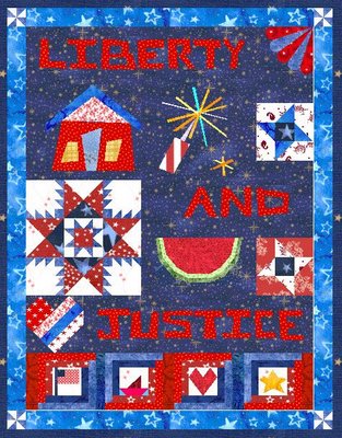
Ok, took out some of the blocks... this is only going to be 30 inches wide, maybe 40 or so long, so I think it WAS getting too busy. The house got changed to a wonky house instead of a traditional block, and I drafted a pieced watermelon instead of an appliqued one. I have some small 2-hole buttons I'll use for seeds. The little pinwheels above the house are now in the border corners.
I am thinking about using the navy with red and white swirly stripes (that I used in the center of the feathered star) for the border, but there's nothing close to that fabric it in EQ's files. Then I'll bind it in something dark.
The two little friendship stars on the right will have vastly different fabric too, since I'm trying to use up more of this patriotic stuff I won. I may put some little faces looking out the house windows. :) But now, is the house too big? hmm.



12 comments:
This new layout looks more relaxing. Doesn't make my brain work so much. I like it.
I like both - but I think the new layout best :-) I really like the wonky house !
Aaaaah it looks great!!! Much better (in my humble opinion) and I love the wonky house and the fire cracker. The pinwheels look very cute in the corners of the border. Well done!!
I like the house that big, like the whole quilt actually! Very nice!
Don't you love finding fabrics for EQ? I love it!
That is looking really great. What a super 4th of july quilt. Love the watermelon.
The quilt looks great! I love how you have the words spaced throughout the quilt top. And the wonky house really adds to it!
Very nice. I just got EQ5 and I'm looking forward to being able to plan quilts better and make sampler quilts.
Love the new layout, especially the wonky house, but I miss the deep red border from the last layout...
I like the house better in this 2nd layout, too, but also agree with Lois that I miss the red border. Can't wait to see this one in fabric!
I think it's perfect! Moving the pinwheels to the corners and putting the wonky house in was just what it needed! Good job!
Oh I LOVE your Liberty and Juststice for all layout! It is so cool!
I do like the second layout much better. It's a very nice pattern... maybe you should market it? :)
Post a Comment